
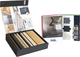
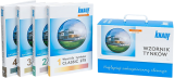






sample books
 packaging
 magnetic boxes
 drawer boxes
 rigid box with lid
 cuffed boxes
 slipcase boxes
 suitcases and chests
 clamshell boxes
 oblique boxes
 round tube boxes
 flat-folding boxes
 folder BOX
 decorative boxes
 chocolate boxes
 cosmetics boxes
 gift boxes
 alcohol and wine boxes
 boxes for CBD
 boxes with a window
 eco friendly boxes
 jewellery boxes
 binders
 folders
 clipboards
 stands
- premium products
 eco products
- other
How to Choose the Sample Book Background Color to Avoid Distorting Sample Colors?
A promotional sample book is a sales tool that only works when the sample looks exactly the same in the client's office as it does on a construction site or in a showroom. An inappropriate border or background color in a sample book can drastically alter the perception of the product in the client's eyes – and instead of facilitating a purchasing decision, it leads to costly complaints. This is not a matter of aesthetics, but the psychology of vision.
Your Brain is Lying – What is Simultaneous Contrast?
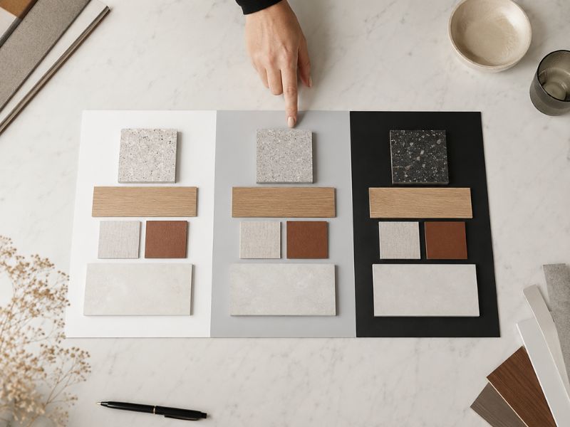
The human eye does not register colors in isolation. Every color is perceived relative to its surroundings – a phenomenon known as simultaneous contrast. The exact same shade of gray plaster looks completely different on a white backing than it does on a dark background. The brain automatically compensates for the environment, shifting the perceived color of the sample toward the complementary color of the background. This effect is particularly dangerous in the B2B segment, where a client makes decisions based on a material sample book shown in an office – and evaluates the final result under natural light on the construction site. An optical illusion built into a bad sample book is one of the main factors of discrepancy between expectation and delivery.
White – The Chief Enemy of Pastel Tones
A white background seems like an intuitive choice. It is "clean", neutral, and modern. In practice, however, white:
- optically brightens samples with warm, saturated colors, pushing them toward grays,
- "dulls" pastel shades, which lose depth and appear dirtier or paler than they actually are,
- disrupts the perceived value of premium products – luxury stone or textured plaster loses its visual weight against a white background.
White works exclusively for samples with very high internal contrast – e.g., black-and-white collages or graphic materials.
Black – The Full Stage for Luxury
Deep black works in the opposite way: it boosts color saturation and intensifies the perceived depth of texture. For sample books of upholstery fabrics, premium wall coverings, or profiled finishing elements, this environment is nearly perfect – the product gains drama and distinctness. The problem arises with dark or highly saturated samples – navy blue on black becomes unreadable, and brown merges with the background. Black is a precision tool, not a universal base for a material sample book.
Gray and Anthracite – The Visual Calibration Standard
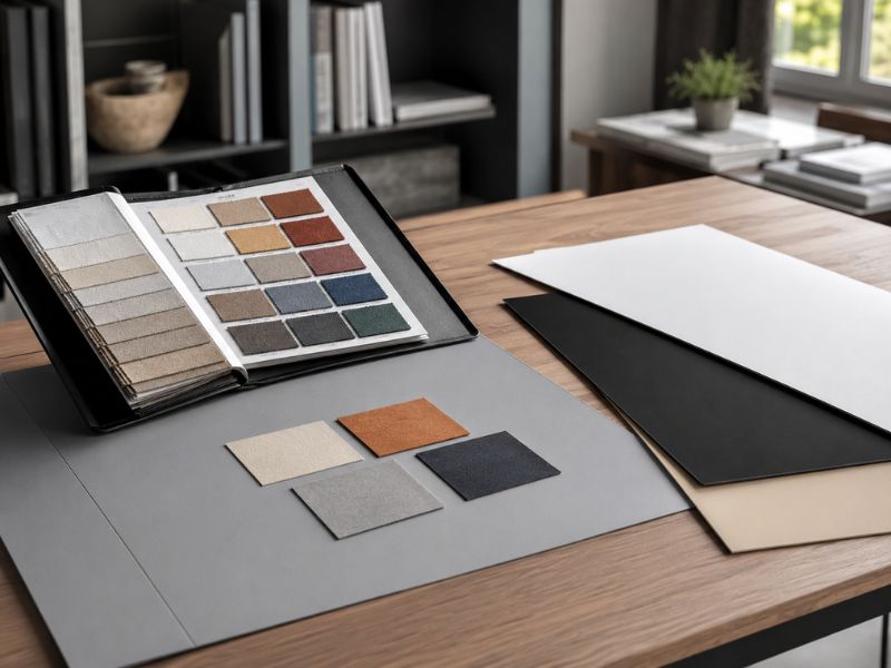
Neutral gray and anthracite are solutions that we use at MILO as an engineering standard for promotional sample books. The reason is grounded in optics: a gray background with low saturation does not interact colorwise with the sample. It does not brighten, it does not dull – it allows for an objective assessment of white balance, texture, and saturation. This is especially crucial for plaster and paint sample books, where the client must evaluate the actual shade, rather than its interpretation by the surroundings. Anthracite as a base reduces perceptual error to a minimum and provides a repeatable, stable point of reference – under both daylight and artificial lighting.
How to Match the Sample Book Background to the Industry and Material?
Selecting the background is a design decision. Key criteria for specific materials include, among others:
- in the case of construction chemicals and plasters – neutral gray or anthracite; the client must evaluate the texture and color without distortion,
- for fabrics and upholstery – black or deep graphite for light samples, gray for a full-tone palette,
- for aluminum profiles and elements – gray ensures legibility regardless of the surface finish.
Presentation systems that combine several bases (e.g., book-style sample books with interchangeable backgrounds) provide the greatest flexibility and respond to the complex needs of multi-colored collections.
A Properly Chosen Sample Book – An Investment in Eliminating Complaints
An improperly selected background is not just an aesthetic issue. Flawed color perception at the selection stage translates into product orders that do not match expectations – and a complaint in B2B costs many times more than a well-designed promotional sample book. Visual calibration of a sample book, taking into account the color neutrality of the background, is nowadays a standard required by manufacturers of construction and finishing materials who want to build trust in their offer.
Check the Sample Book Before Printing Hundreds of Copies
You don't have to guess which background will work for your collection. The MILO design department creates sample mock-ups of the sample book in selected background color configurations, testing them under actual material samples. This is the only certain method to ensure your products are presented without distortion before launching sample book production.
Contact us and order a sample mock-up – before your clients start complaining about a color that never existed.
MILO Group
- +48 71 322 14 44
- info@milogroup.eu
- ul. Stawowa 7-9, 55-002 Dobrzykowice - Wrocław, Poland


© Grupa MILO. Wykonanie: 
sample books
- packaging
- magnetic boxes
- drawer boxes
- rigid box with lid
- cuffed boxes
- slipcase boxes
- suitcases and chests
- clamshell boxes
- oblique boxes
- round tube boxes
- flat-folding boxes
- folder BOX
- decorative boxes
- chocolate boxes
- cosmetics boxes
- gift boxes
- alcohol and wine boxes
- boxes for CBD
- boxes with a window
- eco friendly boxes
- jewellery boxes
- binders
- folders
- clipboards
- stands
- premium products
- eco products
- other