

sample books
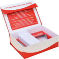 packaging
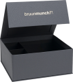 magnetic boxes
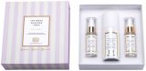 drawer boxes
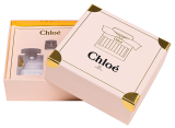 rigid box with lid
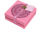 cuffed boxes
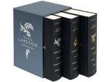 slipcase boxes
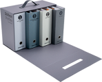 suitcases and chests
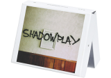 clamshell boxes
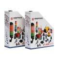 oblique boxes
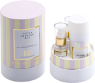 round tube boxes
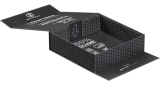 flat-folding boxes
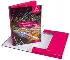 folder BOX
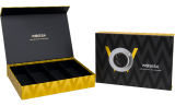 decorative boxes
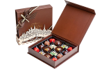 chocolate boxes
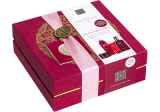 cosmetics boxes
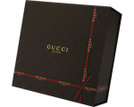 gift boxes
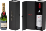 alcohol and wine boxes
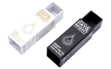 boxes for CBD
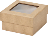 boxes with a window
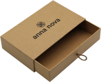 eco friendly boxes
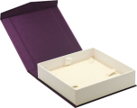 jewellery boxes
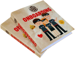 binders
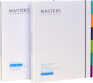 folders
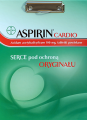 clipboards
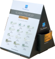 stands
- premium products
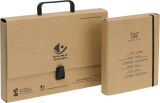 eco products
- other






Blog

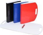
Landscape Binders: When a Horizontal Layout Works Better Than Portrait
The classic portrait ring binder has dominated office document workflows for decades – and it usually serves its purpose. However, it is worth stating clearly that the portrait format is not a universal solution; for many B2B industries, landscape orientation is a strategic choice that directly impacts workplace ergonomics and display quality. Where data presentation performs better horizontally, forcing it into a vertical layout can generate operational losses.
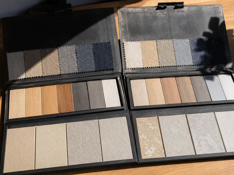
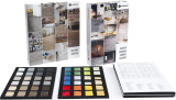
Preventing UV Discoloration: How to Protect Material Samples Inside Closed Sample Books
A faded sample book, stripped of its vibrant colors, doesn't sell – on the contrary, it actively generates losses: incorrect customer orders, complaints, re-production costs, and reputational damage. Sample degradation affects all kinds of fabrics, laminates, wood elements, plasters, and ceramic tiles enclosed daily within presentation systems. Understanding the mechanism behind this process is the first step toward permanently eliminating the problem.
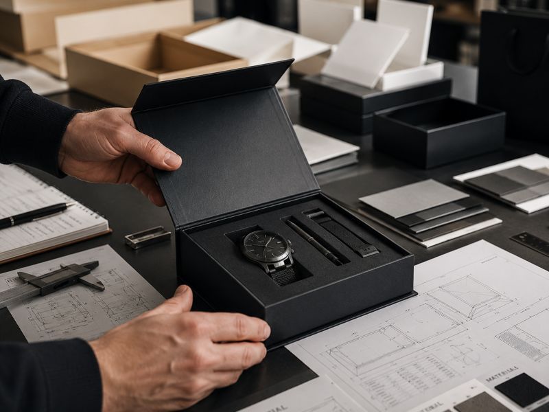
How to Match the Size of a Magnetic Box to Your Product to Avoid the "Slack Fill" Effect?
A customer opens an elegant magnetic box, feeling its weight and solid rigid board construction in their hands – only to find a product that gets lost inside a space several times too large. This moment of disappointment has a name: the "slack fill" effect, and it is one of the most costly mistakes in premium packaging design. It triggers cognitive dissonance – the promise made by the packaging does not match reality, which directly harms the product's perceived value and brand trust.
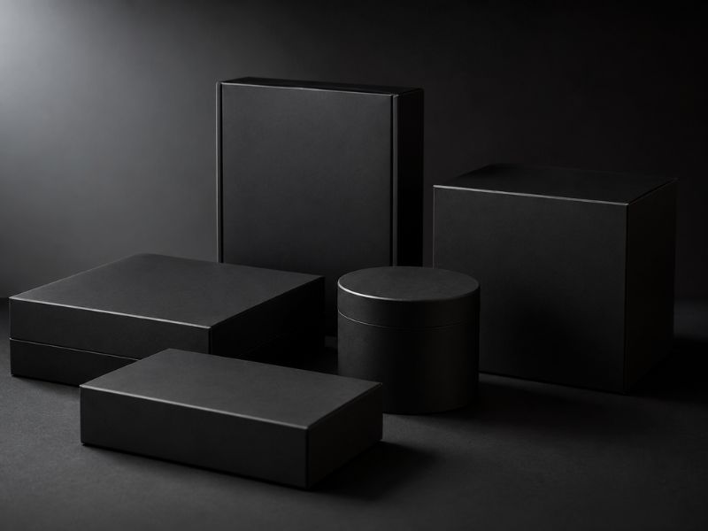
Black Product Boxes – How to Avoid Fingerprints and Ensure the Highest Aesthetics?
Black has long defined luxury. It is a color that, in the world of premium packaging, communicates exclusivity, precision, and class even before the customer reaches for the product. The problem is that dark surfaces mercilessly reveal every touch – a fingerprint on a black box can ruin the entire unboxing experience in a fraction of a second. The good news is that materials engineering now provides designers with effective tools to prevent this.
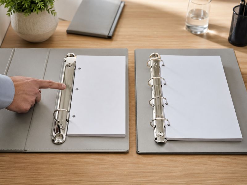
2-Ring or 4-Ring Mechanism? How to Choose the Right Ring Binder Mechanism?
A poorly chosen ring mechanism is a silent sabotage of documentation – it damages page edges, deforms the contents, and hinders a seamless presentation of the offer to the client. Choosing the binder mechanism is a matter of engineering, not aesthetics: the distribution of forces acting on the pages, the weight of the contents, and the frequency of page-turning determine which mechanism will actually do the job. In the B2B segment, where promotional binders serve as a company's business card, a mistake can be costly.
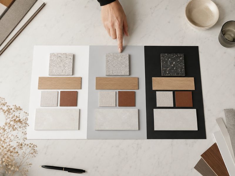
How to Choose the Sample Book Background Color to Avoid Distorting Sample Colors?
A promotional sample book is a sales tool that only works when the sample looks exactly the same in the client's office as it does on a construction site or in a showroom. An inappropriate border or background color in a sample book can drastically alter the perception of the product in the client's eyes – and instead of facilitating a purchasing decision, it leads to costly complaints. This is not a matter of aesthetics, but the psychology of vision.
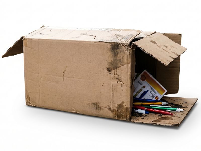
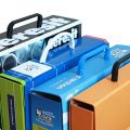
Why cheap product boxes damage your brand image?
Today, packaging is an investment in your margin. The moment a customer holds a box in their hands—even before they see the product — they form a first and often lasting opinion about its value. Poor packaging quality is the first red flag for a premium customer; a signal that is very rarely reversible.
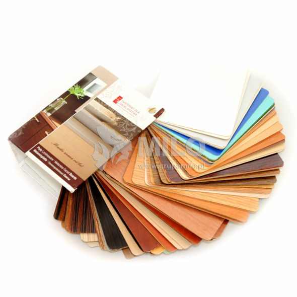
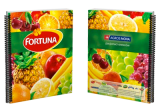
Waterfall, book-style, or fan-out sample books – which model will best showcase your product?
A sample book is a brand's most important salesperson—it works in the showroom, on the negotiation table, and in a representative's bag long before the first word about price is spoken. Its construction must stem from two premises simultaneously: the physics of the material it presents and the way the customer makes a purchasing decision. Ignoring even one of these factors ensures that even the most carefully crafted sample book stops selling.
MILO Group
- +48 71 322 14 44
- info@milogroup.eu
- ul. Stawowa 7-9, 55-002 Dobrzykowice - Wrocław, Poland


sample books
- packaging
- magnetic boxes
- drawer boxes
- rigid box with lid
- cuffed boxes
- slipcase boxes
- suitcases and chests
- clamshell boxes
- oblique boxes
- round tube boxes
- flat-folding boxes
- folder BOX
- decorative boxes
- chocolate boxes
- cosmetics boxes
- gift boxes
- alcohol and wine boxes
- boxes for CBD
- boxes with a window
- eco friendly boxes
- jewellery boxes
- binders
- folders
- clipboards
- stands
- premium products
- eco products
- other